This piece is a paradigm of monochrome glaze official ware from the Ming Xuande reign. Its form is that of an upturned bell, conveying a sense of solidity and dignified bearing. The bowl measures 14 cm in diameter and 11 cm in height, with precise proportions and elegantly full, flowing curved walls, standing on a ring foot. The body is robust and substantial, representing a classic Xuande-period form. The entire piece, including the interior of the foot, is covered in a rich, lustrous soy-brown glaze (also historically called "purple-gold" glaze). At the center of the base, within a double underglaze-blue circle, is the six-character mark "Da Ming Xuande nian zhi" in regular script, written with powerful brushstrokes. The vibrant blue of the mark stands in striking yet harmonious contrast with the warm, subdued soy glaze. This bowl masterfully combines the vigorous and heroic character of Xuande imperial ware with the restrained beauty of monochrome glazes, making it an enduring masterpiece among Ming dynasty imperial color-glazed porcelains.
---
### I. Formal Origins: The Upturned Bell Form, an Embodiment of Ritual and Musical Spirit
The "upturned bell" bowl form resembles an inverted ancient bell, its very name implying solemnity and uprightness. This shape did not originate in the Xuande reign but was seen earlier in the Yongle period; however, it reached a level of greater technical refinement and monumental presence by the Xuande era. Observing this piece: the line flows seamlessly from the slightly everted rim down the curving sides to the subtly tapered foot, without any awkwardness. The ratio of its height (11 cm) to its diameter (14 cm) approaches the golden section, giving a visually stable and substantial impression, devoid of any delicacy. This perfectly aligns with the imperial aesthetic demand for "ancient elegance and refined, pure, substantial form" as recorded in contemporary texts like the Xuande Ding Yi Pu ("Manual of Xuande Bronzes and Ritual Vessels"). Beyond daily court use, this form of bowl was also employed in rituals and display, embodying the principle of "vessels conveying the Way" central to ritual thought.
### II. Examination of the Glaze: The 'Purple-Gold' Name, the Pinnacle of Archaism and Innovation
The soy glaze applied to this piece is a celebrated variety among Xuande monochromes. Its color is not uniform; within the deep brown-ochre, a reddish-purple luster subtly emerges, reminiscent of aged rosewood or the patinated surface of ancient bronze, hence its elegant name "purple-gold glaze." The technique required was extremely demanding:
*Coloration Principle**: Using iron as the primary coloring agent, it was fired in a single high-temperature reduction firing. Slight variations in the glaze formula, application thickness, or kiln atmosphere would immediately cause discoloration. The Xuande imperial kilns' control was masterful, resulting in the bowl's uniform, pure color and inner radiance.
*Glaze Characteristics**: The glaze layer is thick and unctuous to the touch. Areas where the glaze pooled are noticeably darker, and natural rivulets are visible near the foot, yet their boundaries are soft, demonstrating the precision of the glaze mixture and the exactitude of the firing temperature. The surface exhibits a very fine network of colorless crackle, naturally formed over time, adding an archaic charm.
*Archaism and Symbolism**: Its color imitates Song and Yuan soy glazes and the "purple" glaze of Ding ware, but on a deeper level, it emulates the hues of ancient bronze vessels and treasured palace collections. This reflects the Xuande Emperor Zhu Zhanji's taste for archaism and his aim to revive ritual and music. This serene, solemn glaze color, devoid of ostentation, exemplifies the diverse aesthetic maturity of the Xuande period, capable of confidently navigating between the vibrant (as in blue-and-white or underglaze-red) and the tranquil (as in sweet white or soy glaze).
### III. Inscription and Period: The Underglaze-Blue Regular Script, a Definitive Standard
The base mark "Da Ming Xuande nian zhi" in six characters is one of the most representative inscription types for Xuande imperial ware. Its features are distinct:
1. Calligraphic Style: Regular script, executed with neat, vigorous strokes, clear starting and ending points, adhering to the standards of Jin and Tang dynasty calligraphy. Notably, the character "De" (德) is often written without the horizontal stroke on the "heart" component (as "徳"), a key period characteristic of Xuande marks.
2. Layout and Coloration: Written within a double circle, the characters are compactly arranged, filling the base space—a feature later described as "**Xuande marks covering the vessel**" for bowl-type objects. The cobalt used is imported "Sumali blue," exhibiting iron-rust spotting within the brushstrokes. Where dense, it penetrates the body, creating a strong yet harmonious contrast with the surrounding soy glaze, making it highly distinctive.
3. Technical Significance: Writing the underglaze-blue mark on the dark soy-glazed ground required applying the glaze first, then inscribing the mark before the final firing. This demanded exceptional skill from the artisans in managing the interaction between the cobalt and the glazed surface. The successful firing of this mark is itself a testament to the absolute technical confidence of the Xuande imperial kilns.
### IV. Historical Context and Summary of Value
Although the Xuande reign lasted only a decade, its imperial kilns—under the emperor's direct interest and the management of capable supervisors—achieved a golden age in the history of Chinese porcelain. The upturned bell form of this piece inherits the spirit of the Yongle period while becoming more regimented; its soy-brown ("purple-gold") glaze synthesizes archaistic models while creating a unique style; its underglaze-blue mark became a benchmark for period authentication.
Rejecting painted decoration, this bowl constructs a complete, aesthetically compelling world through form, glaze color, and inscription alone. It is not merely a functional court vessel but an artistic masterpiece integrating ritual norms, imperial taste, and technical limits. Its serene, archaic glaze seems to crystallize the brilliance and confidence of the Xuande era in the most understated and timeless manner. Having endured six hundred years, its charm remains undiminished, inspiring reverence for the pinnacle of craftsmanship achieved during the Ming dynasty's prosperous age.
大明宣德酱釉仰钟式碗鉴赏
本品为明宣德朝单色釉官窑之典范,形取仰钟,沉稳而挺拔。碗口径十四厘米,高十一厘米,比例精准,器壁弧线流畅饱满,底承圈足,胎骨坚致厚重,乃宣德一朝经典制式。通体及足内满施酱釉,釉面肥厚莹润,色呈赭褐,古雅深沉,时人亦称“紫金釉”。底心双青花圈内书“大明宣德年制”六字楷书款,笔力遒劲,青花发色浓妍,与温润酱釉相映,更显庄重肃穆。此碗集**宣德官窑雄健之气**与**单色釉内敛之美**于一身,堪称明代御窑颜色釉瓷中隽永之作。
---
### 一、器形渊源:仰钟之式,礼乐精神的化现
“仰钟式”碗,形似倒置古钟,其名已寓**庄严端正**之意。此器形并非宣德首创,早见于永樂时期,然至宣德而**技艺愈精,气度愈宏**。观本品:自口沿微侈而下,腹部弧收,至底足略敛,线条一气呵成,毫无滞涩。其高度(11cm)与口径(14cm)之比例,近乎**黄金分割**,予人视觉以稳重敦实之感,毫无纤巧之态,恰合《宣德鼎彝谱》中“形制古雅,精纯浑厚”之皇家审美要求。此式碗除作宫廷日用器外,亦常用于祭祀、陈设,体现“器以载道”的礼制思想。
### 二、釉色探微:紫金之名,仿古创新的巅峰
本品所施酱釉,乃宣德单色釉中名品。其釉色并非单一,于浓重赭褐中隐隐透出**赤紫光泽**,犹如经历岁月洗礼的紫檀木或古代青铜器表层,故得“紫金釉”之美誉。此釉工艺要求极高:
*呈色原理**:以**铁**为主要呈色剂,经高温还原焰一次烧成。釉料配方、施釉厚度及窑火氛围稍有不均,则色差立现。宣德御窑对此控制已臻化境,故本品釉色**均匀纯正,宝光内蕴**。
*釉质特征**:釉层肥厚,抚之若凝脂。积釉处颜色尤深,近足处可见自然垂流,然界限柔和,足见其**釉料调配之精与烧造火候之准**。釉面开有极细密之**无色纹片**,为岁月天成,更添古拙韵味。
*仿古与象征**:其色仿宋元酱釉、定窑紫定,更深层次则是摹拟**古代青铜器**与**宫廷藏珍**的色泽,呼应了宣德皇帝朱瞻基好古摹古、复兴礼乐的旨趣。此釉色沉静肃穆,毫无炫彩,正体现了宣德时期**在热烈(如青花、釉里红)与静谧(如甜白、酱釉)之间从容驾驭的多元化审美高度**。
### 三、款识与时代:青花楷书,一代标准
底款“大明宣德年制”六字,为宣德官窑最具代表性的款识形式之一。其特点鲜明:
1. 书写风格:楷体,笔法**工整刚劲**,起笔收锋分明,有晋唐楷书法度。其中“德”字“心”上无一横(“德”字常写作“徳”),为宣德款重要时代特征之一。
2. 布局与发色:书于双圈之内,排列紧凑,占满底足空间,此即后世所称“**宣德款满器身**”在碗类器物上的体现。所用青料为进口“苏麻离青”,笔触中可见**铁锈斑沉淀**,色浓处深入胎骨,与周围酱釉形成强烈而和谐的对比,极具辨识度。
3. 工艺意义:在深沉酱釉地上书写青花款,需先施釉后书款,再入窑烧成,对工匠把握青料特性与釉面关系的能力要求极高。此款成功烧就,本身就是宣德御窑**绝对技术自信**的体现。
### 四、历史背景与价值总结
宣德一朝虽仅十年,然其御窑厂在帝王的直接关注与杰出督陶官的管理下,成就了中国瓷器史上的**黄金时代**。本品之仰钟式造型,承永樂之气韵而更趋规整;其酱釉(紫金釉)之色,集仿古之大成而独创一格;其青花款识,更成为断代鉴定之圭臬。
此碗摒弃彩绘,仅以**造型、釉色、款识**三者,便构建起一个完整的、充满张力的审美世界。它不仅是实用的宫廷器皿,更是融合了**礼制规范、帝王品味、工艺极限**于一体的艺术杰作。其沉静古雅的釉色,仿佛将宣德朝的辉煌与自信,以一种最为含蓄而永恒的方式凝结其中,历六百年光阴而魅力不减,令人观之,顿生思古之幽情,仰止于大明盛世之工艺文明。
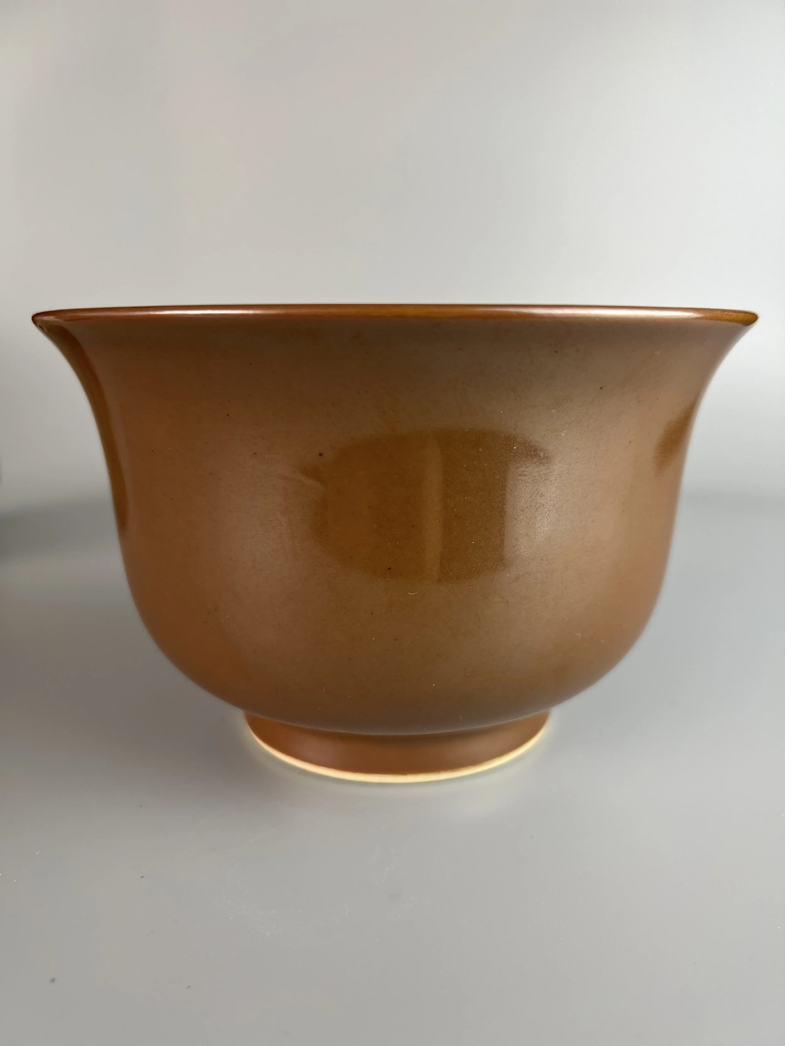 Image 1 of 12
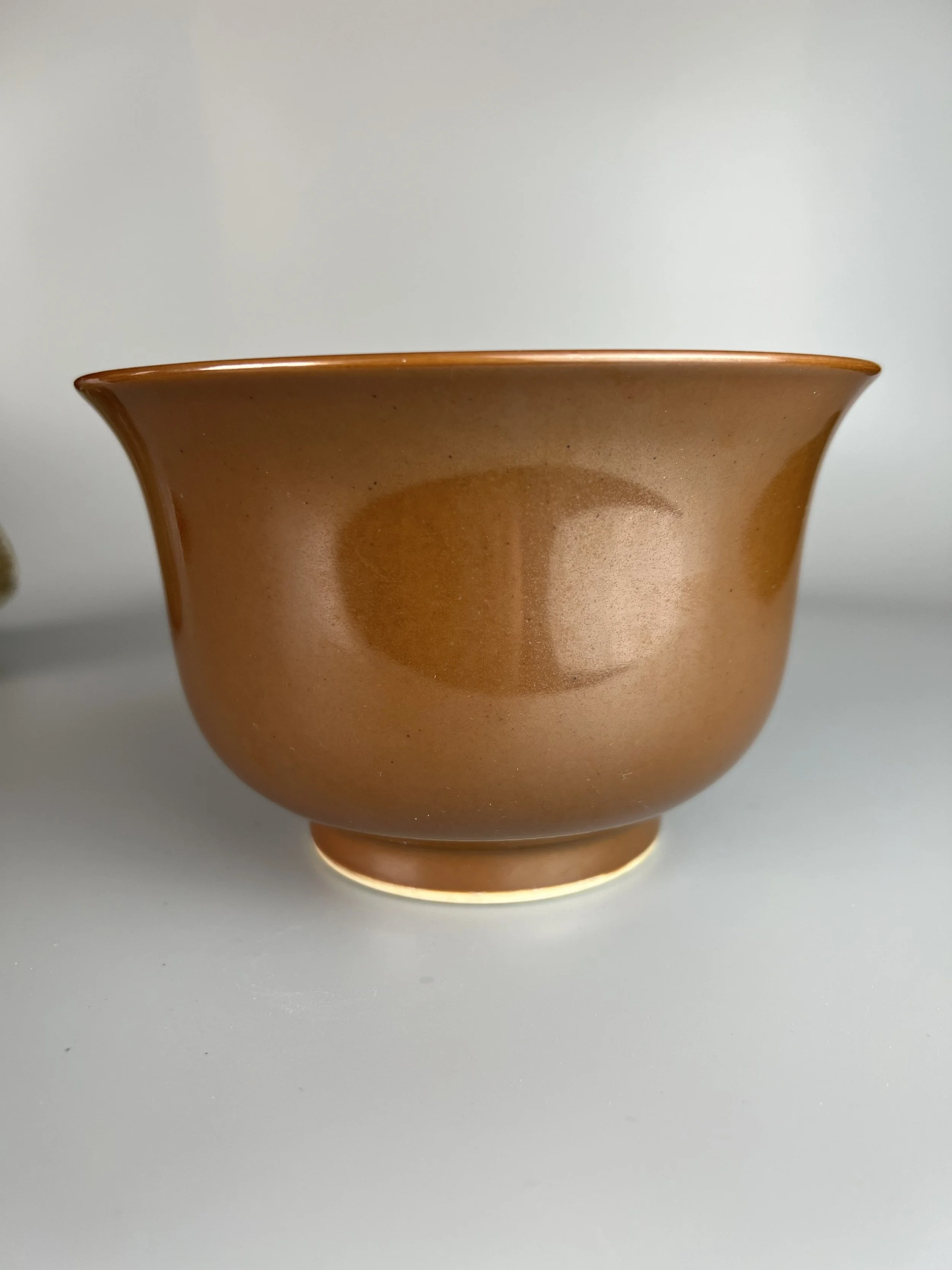 Image 2 of 12
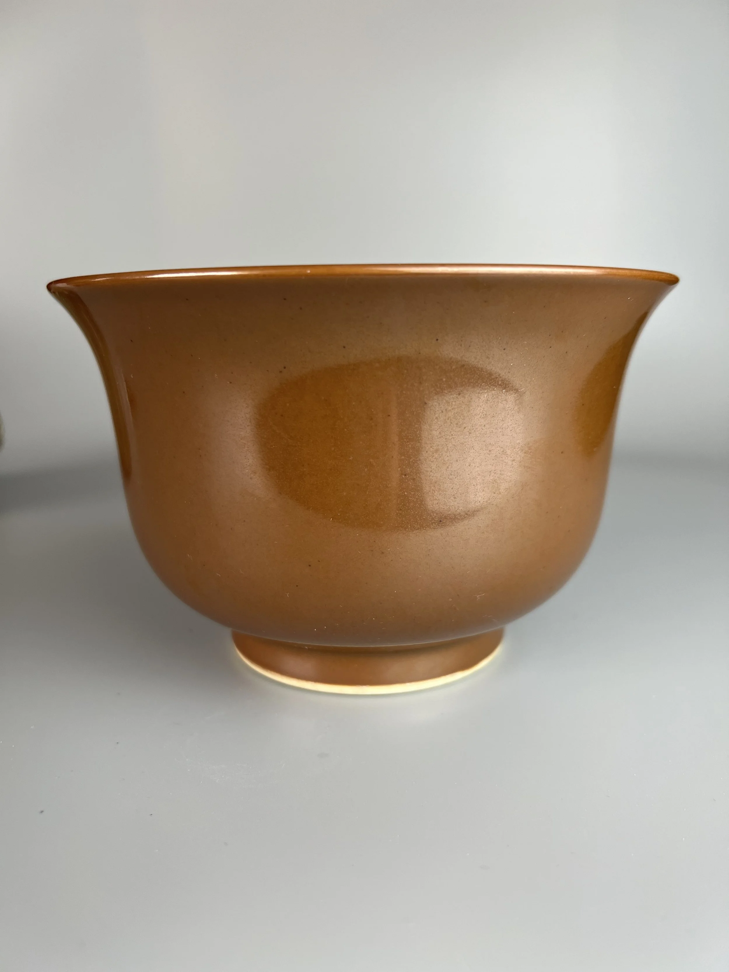 Image 3 of 12
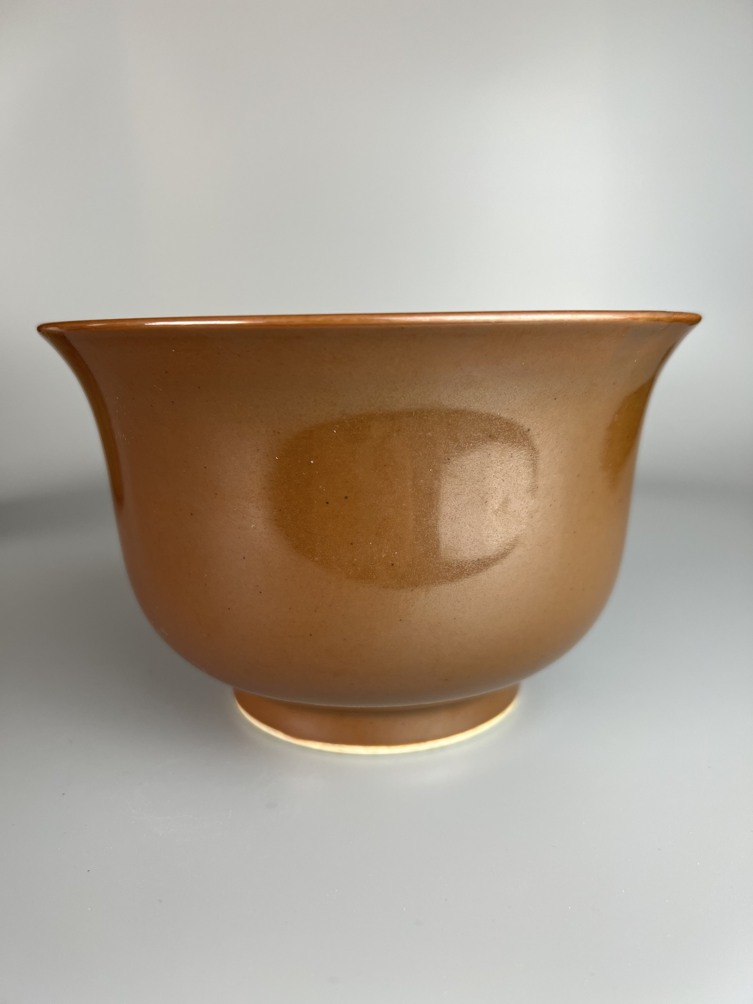 Image 4 of 12
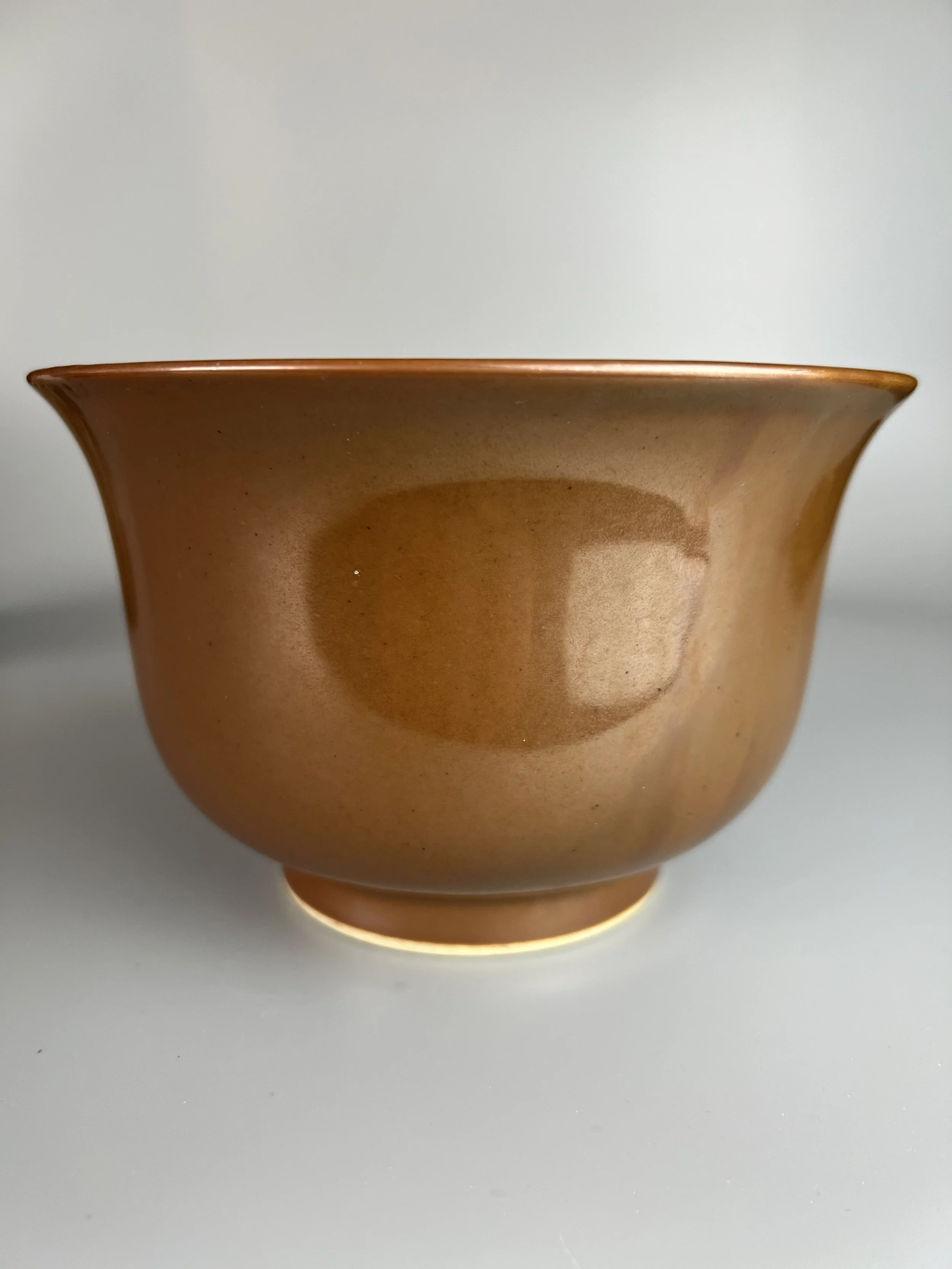 Image 5 of 12
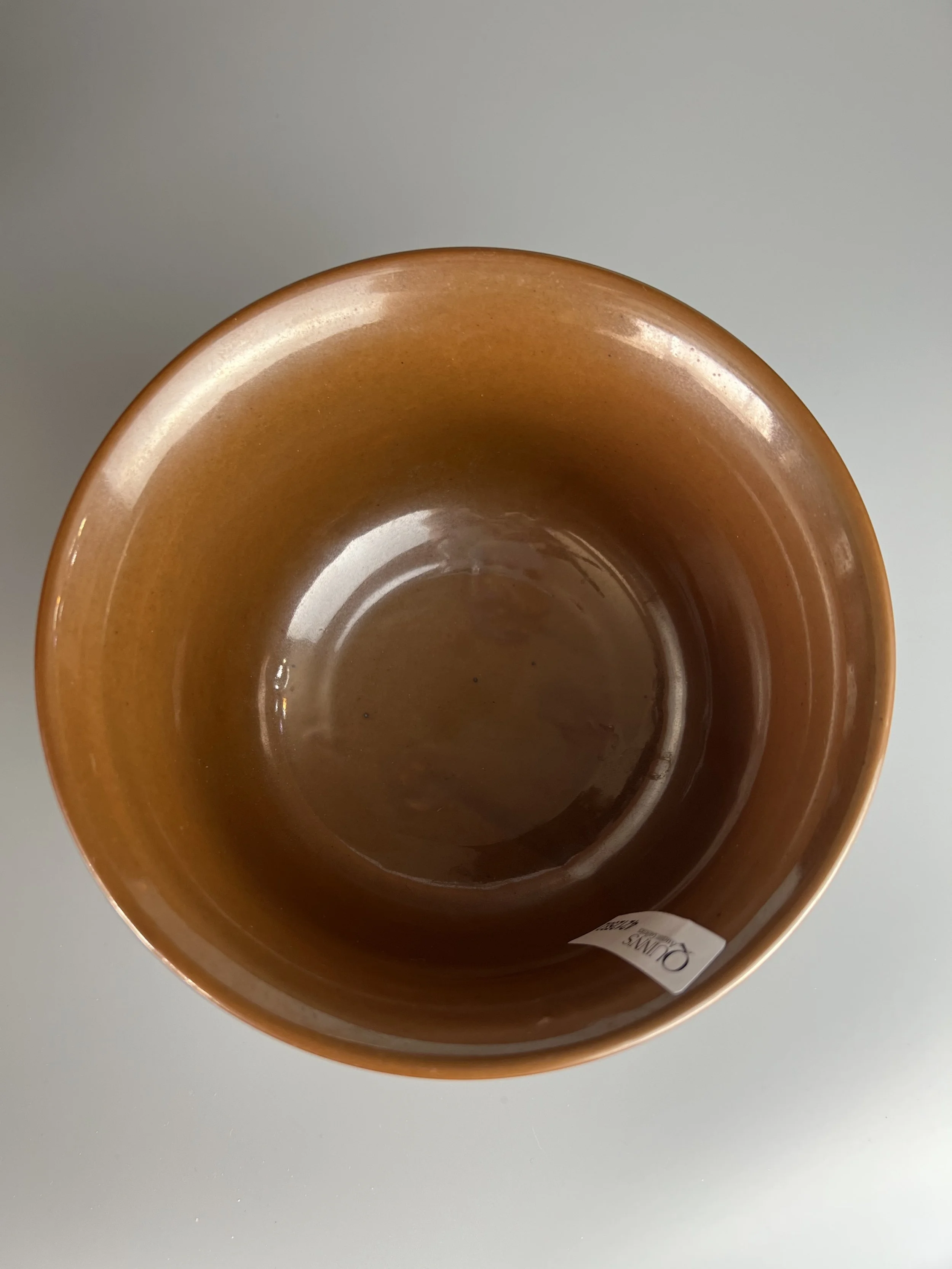 Image 6 of 12
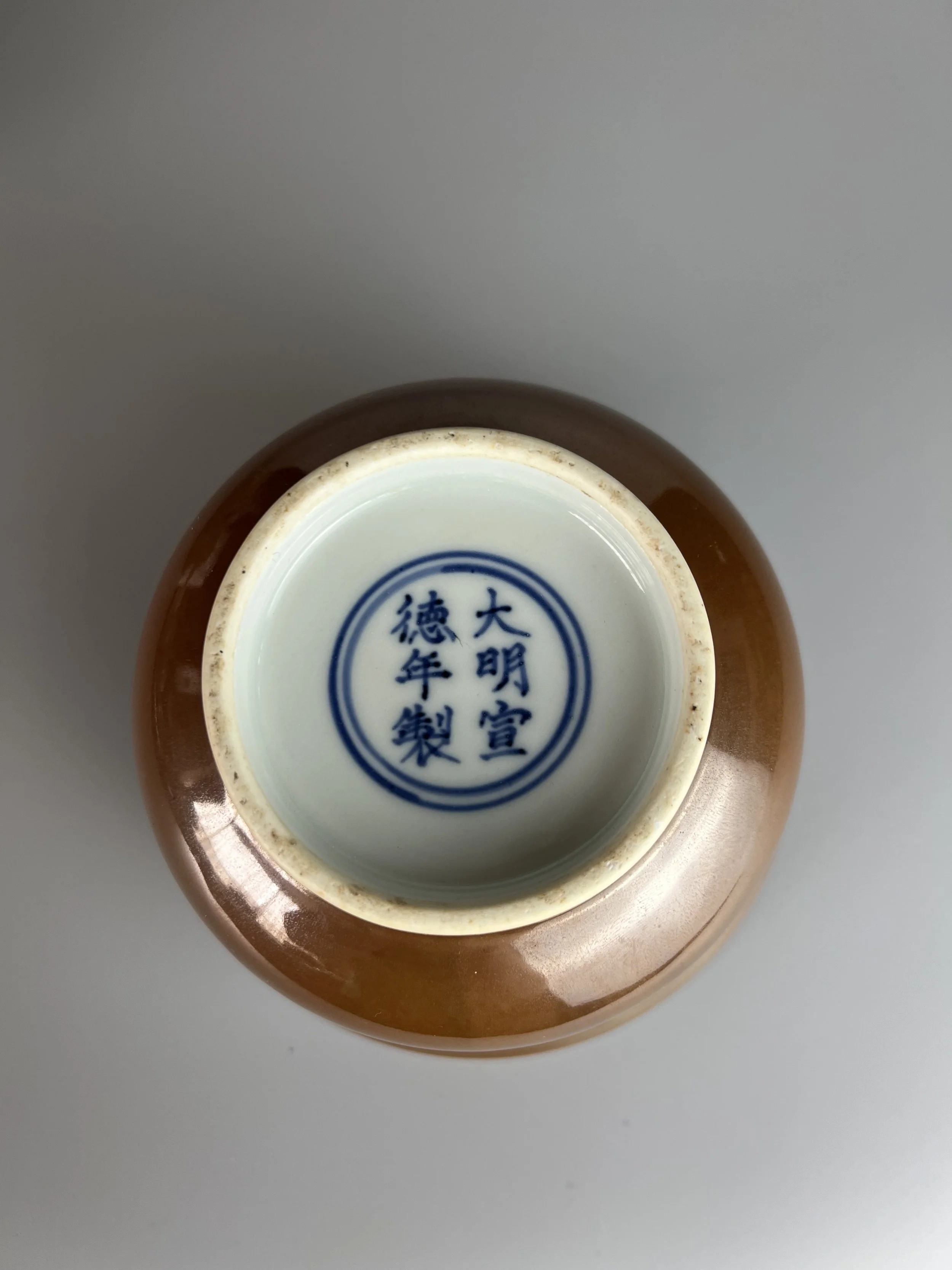 Image 7 of 12
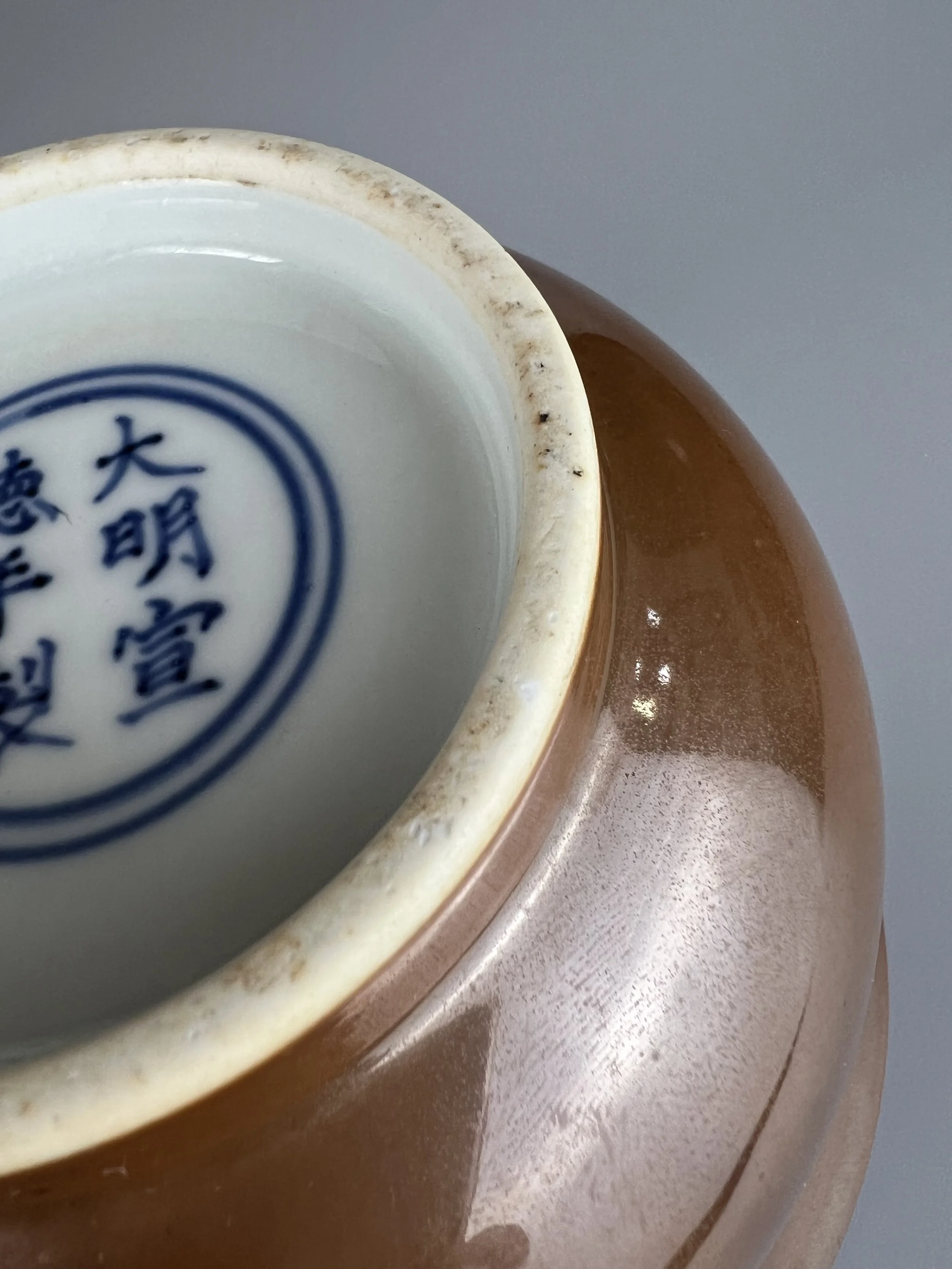 Image 8 of 12
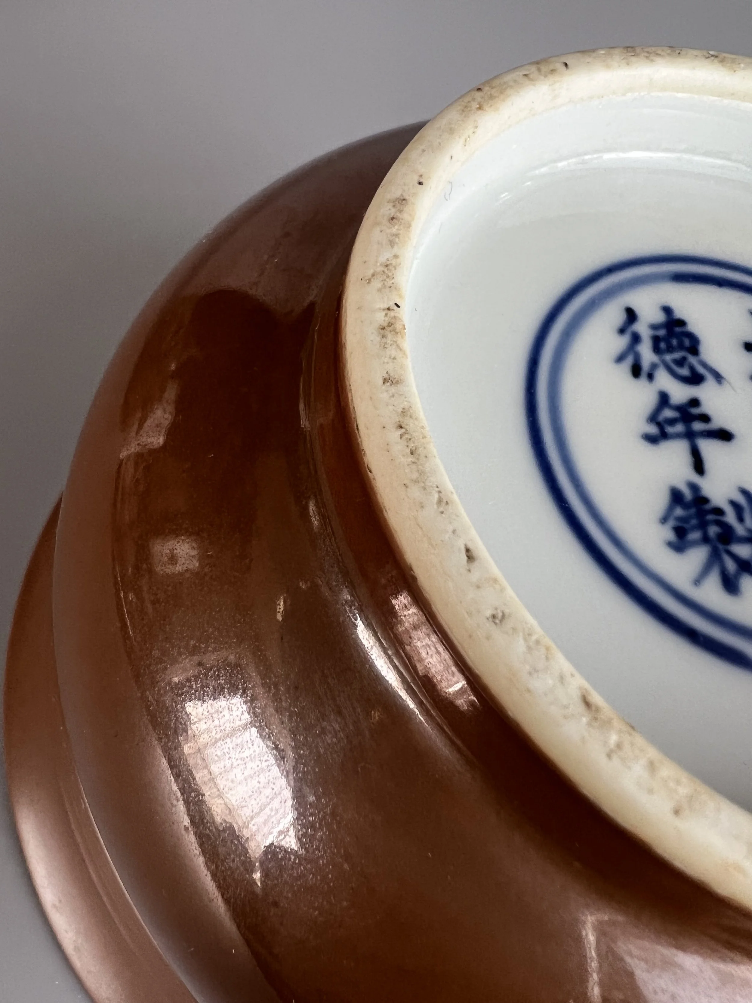 Image 9 of 12
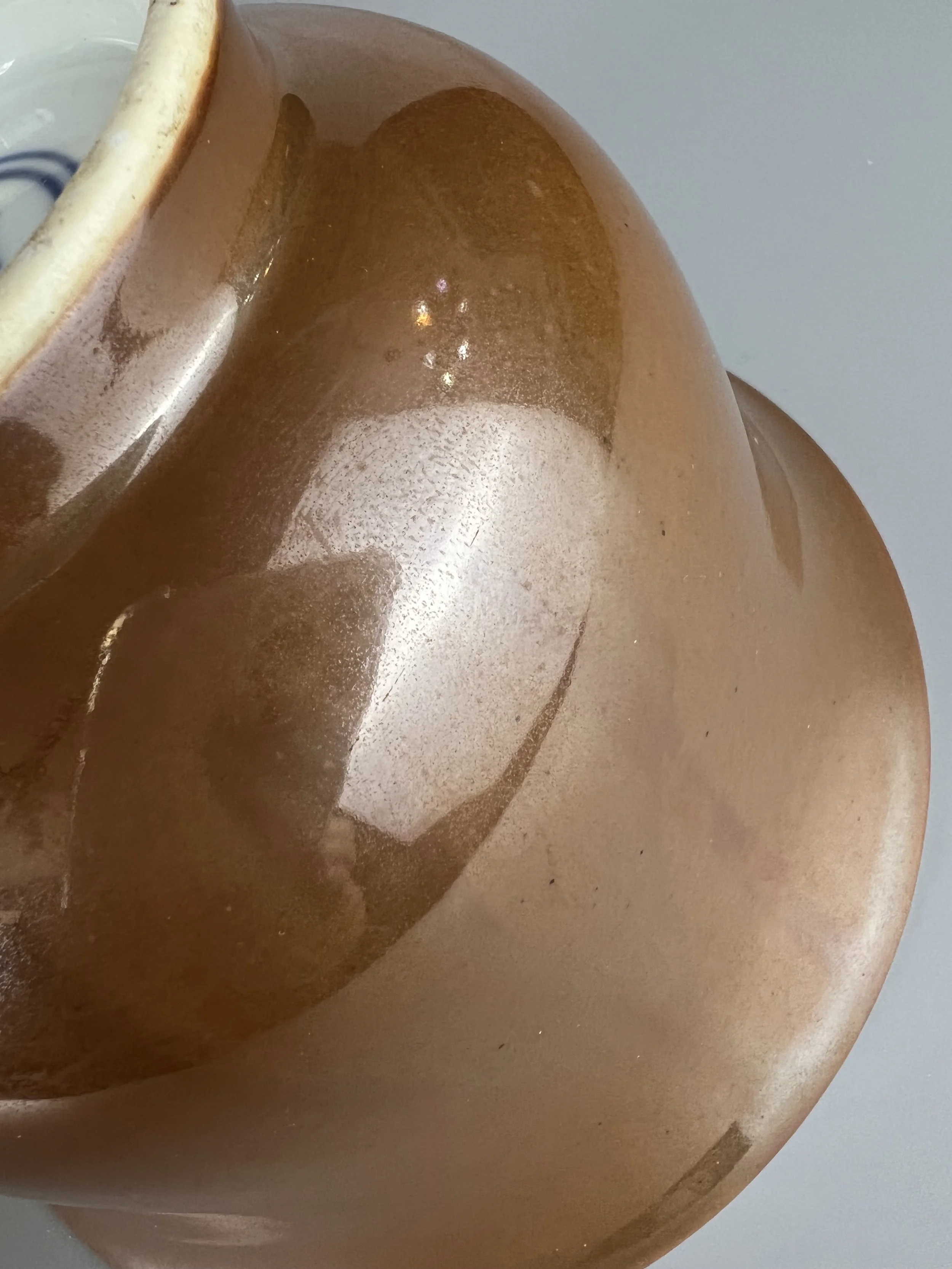 Image 10 of 12
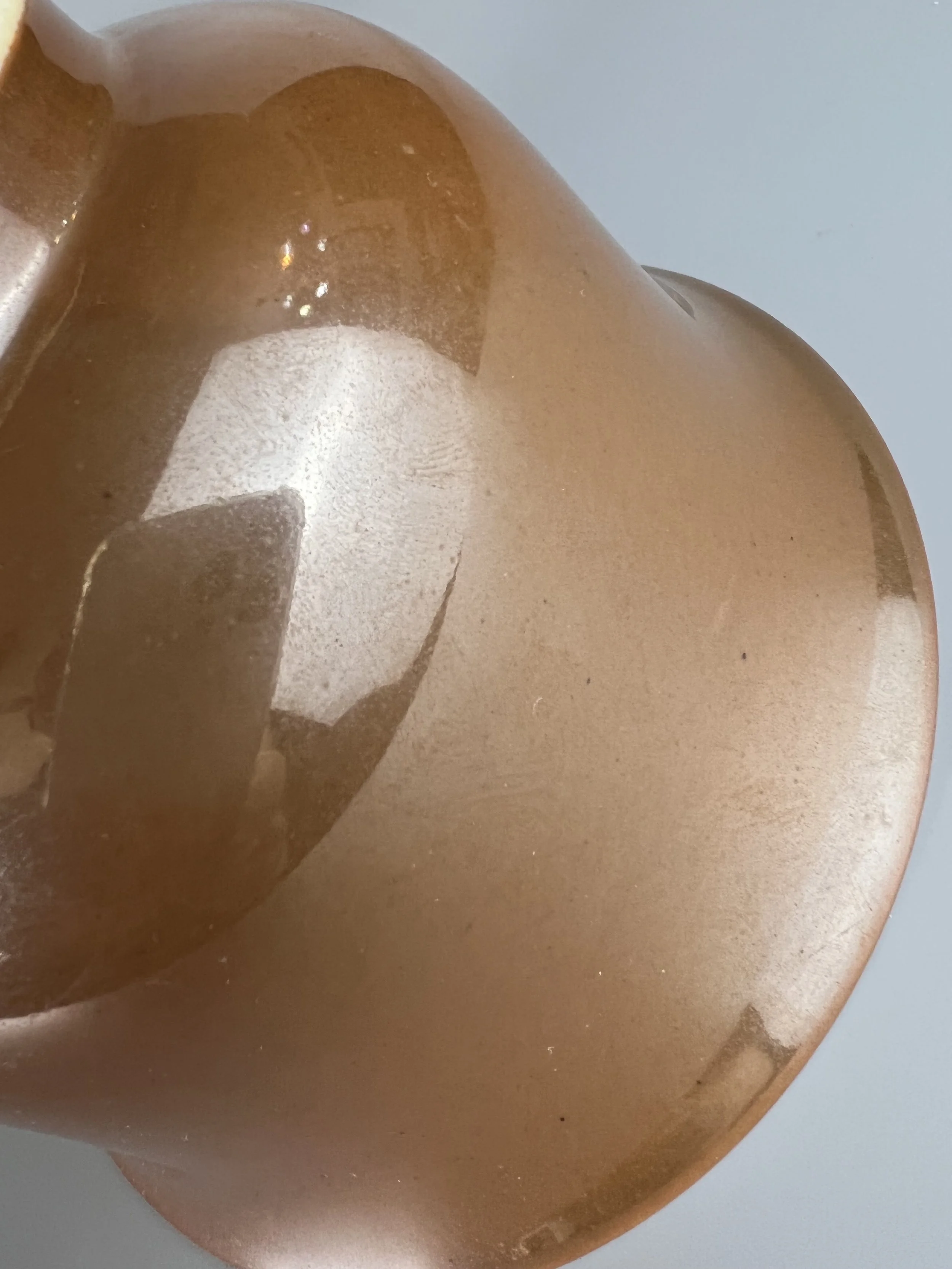 Image 11 of 12
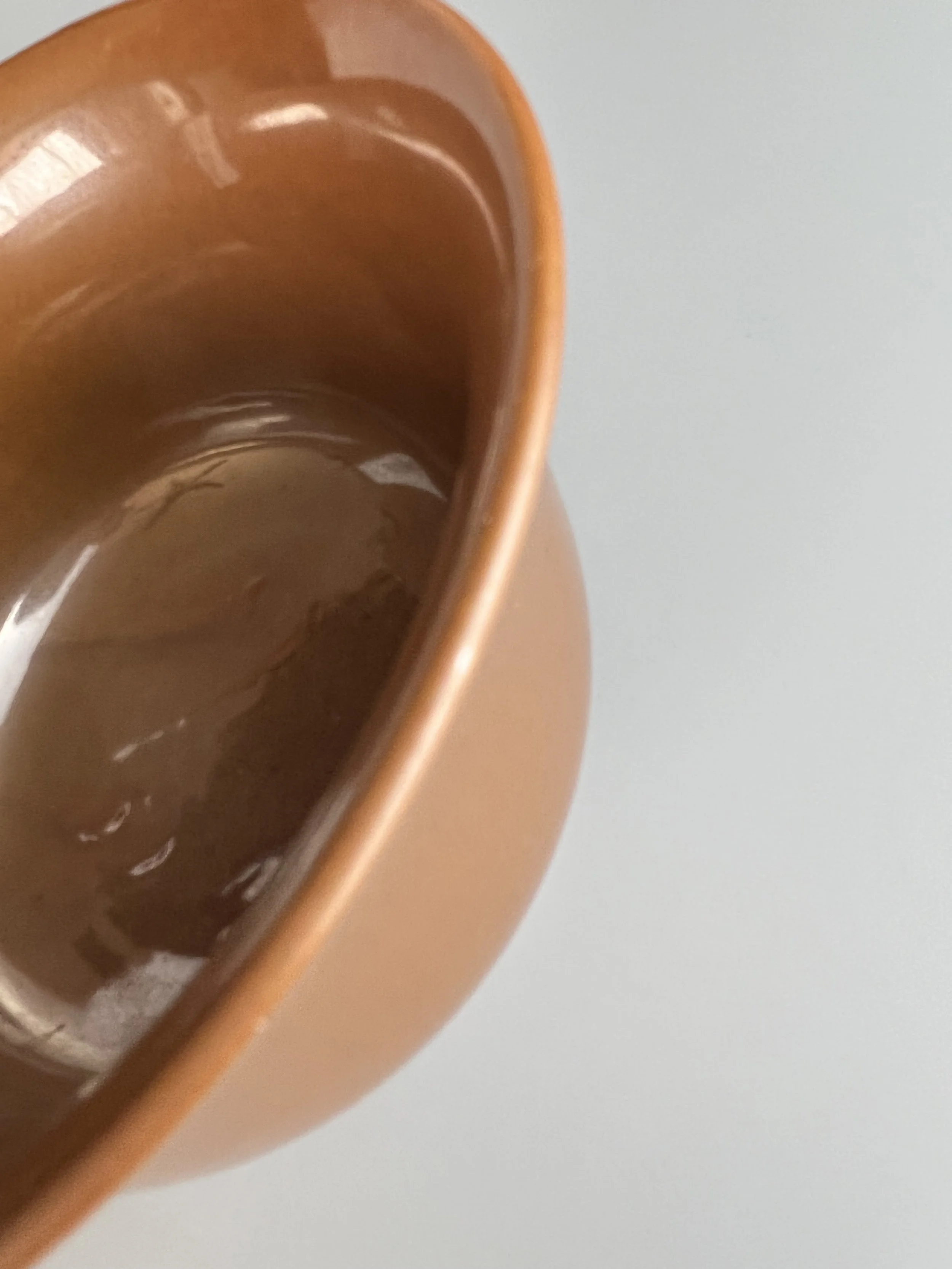 Image 12 of 12